My latest article, How this hospital prevents blocked elevator entrances through a core information architecture principle, sparked an interesting discussion on control.
If you missed it, I wrote about a positive experience I had at a massive hospital, powered by the key IA principle of grouping. Instead of letting thousands of patients, healthcare practitioners, visitors, and students coordinate floors (Going up? Going down?), they automatically grouped us based on the floor we picked. I get into the details in the article and how to apply the principle to digital products, but this story was the gist of it.
Readers commented on the fact that people grumble about a perceived loss of control. For example, an elevator passenger might change their mind while in the lift, and these types of elevators wouldn’t give them the option to switch mid-flight.
The issue of control comes up frequently in projects with my clients.
Control in information architecture projects manifests itself in two main ways.
First – Content governance, or a clear, shared understanding of team member responsibilities and processes related to content management. Who is in charge of what, and what are the relevant steps, team members, and tools? Many companies lack clear content governance and struggle through arduous, repeated, siloed processes with diminished returns because of it.
Second – User control. How much control should the user have over a workflow? When should this control be presented to them? How should control be framed? Is it a given? Is it a benefit? Or is it a risk, saved for power users, hidden under pesky “Advanced“ or “Danger zone” content containers?
Control–how much of it, when, how should it be framed–comes up frequently in client projects.
In a recent project, I evaluated the product content’s clarity, consistency, and hierarchy for a SaaS platform. Users had 5 different ways to get started with the platform. The trial experience review, in tandem with product analytics data from Amplitude, revealed a tricky issue.
Users selected the onboarding wizard as their preferred way to get familiarized with the platform. The wizard provided assistance, but users were quitting the wizard entirely in the first few steps. As it turns out, the platform didn’t allow users to retain fundamental autonomy in the experience, rather “bossing them around“ without giving them the option to exit the onboarding process and interact with alternative interface elements beyond the recommended suggestions.
The wizard was supposed to assist users in quickly getting familiar with a data-heavy, complex platform. The user control suppression made users drop the experience entirely, resulting in likely hundreds of thousands lost. Those enterprise contracts are costly, and so is an SQL (Sales Qualified Lead) in the space, who is being pitched left and right.
On the other hand, I’ve also seen the opposite side of the user control spectrum negatively affect user satisfaction and conversions.
Putting users in charge of their experience sounds like a good idea in theory. One day, someone said, why should I look at a glaringly white screen all day? And so dark mode was invented. Another day, some other smart person created Previews, giving technical editors the ability to review the experience from the user’s standpoint and make any necessary changes beforehand.
In practice, there are tens of decisions the user needs to make within apps and platforms, and hundreds (thousands?) of others about what they’re going to eat, drink, wear, say, and do in any given day.
Every additional word and step adds cognitive load, which results in mistakes, frustration, and abandoning the process altogether.
Become the guardian of users’ mental load by taking any chance you can to declutter the UI.
Questions to ask:
- Are additional controls aiding users in reaching their goals within the product?
- If so, how can we improve the control experience for maximum clarity and conversions?
If your team is unsure how multiple options are affecting users, here’s how you can find out:
- Pick a high-visibility product interface, e.g., the download page for a browser extension, notification templates for an HR platform.
- Review analytics data. Focus on key actions such as downloading the extension or duplicating a template, and potential problematic areas, such as high drop-offs, rage clicks, and long Time-on-task (the time it takes users to complete key actions).
- Manually review screen recordings if possible, to get a more qualitative understanding of the experience.
- Look at the story the data tells you. Are users struggling or are they completing key actions promptly?
If additional options are confusing users, causing them to drop-off or rage click, or just generally spend a long time figuring out where stuff is, remove them and prioritize the experience/options that are working.
If users are interacting with additional options as expected, you can still improve the control experience for maximum clarity and conversions.
- Review the language for clarity – user language vs technical jargon, unnecessary repetition, ambiguous or non-descriptive language
- Review the language for consistency – different terms used to refer to the same thing across interfaces
- Review information load – too much or too little information based on which step of the user’s journey they’re in
- Review the interaction design for simplicity – use clear distinctions and groupings like accordions, anchor links, and subsections
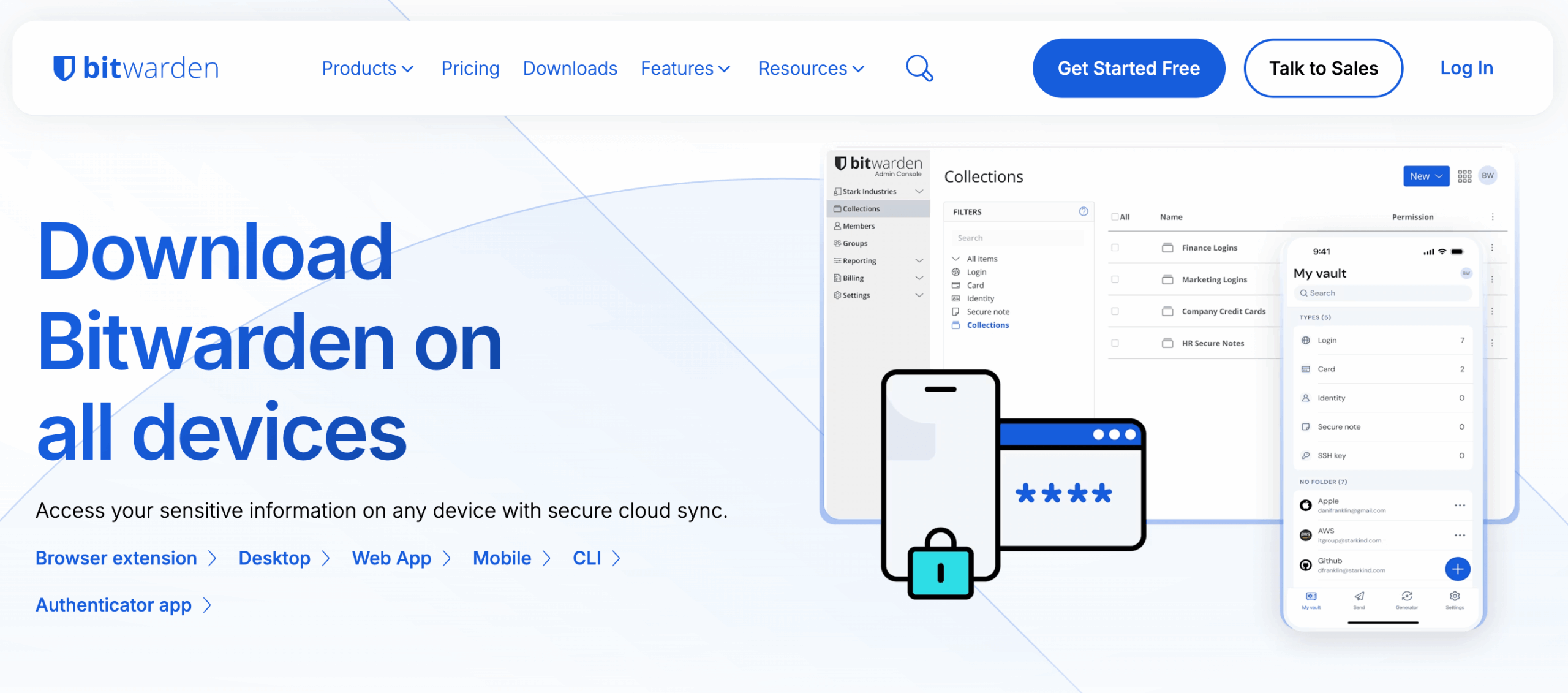
Finally, for an example of user controls done effectively, we’ll take a look at Bitwarden, the password manager tool.
The Downloads page features 6 download options at a glance, using anchor links to save users time by allowing them to jump to relevant sections.

The most widely-used web browser, Google Chrome, is selected by default, again, to save users time and reduce the number of choices needed. A nice touch here is the inclusion of browser logos, which actually aids rather than hinders understanding.

Everything is revealed step by step (the technical term for this is progressive disclosure). Instead of displaying all the options users have: 9 web browsers, 3 operating systems for desktop, 2 operating systems for mobile, 6 platforms for command line interface (CLI), 2 authenticator apps, Bitwarden offers control while displaying information in user-friendly, cognitive-load-conscious ways.

Hundreds of similar information structure choices heavily affect the way a user perceives a system, whether that’s a site, a platform, or a hospital.
Clear content governance creates aligned teams with faster approval processes and more production-ready content.
Thoughtful user controls, based on key actions, product analytics, and matching user language, create smoother user experiences and positively affect user retention. Clear, consistent experiences lead to happy customers.
AI Policy: I personally write each draft and final copy on this website. All content reflects my own thinking, ideas, style, and craft. I do not use AI such as ChatGPT or other LLMs to generate articles. Occasionally, I ask AI (such as Formalizer or Equativ) to summarize or re-state my own ideas and may restructure sections based on the response.