Guide users through the product
Articles and case studies on creating digital experiences that are easy to navigate and understand through improved navigation and language.
-

Are your content groupings driving growth… or driving users away?
How to improve user understanding, speed up information retrieval, and reduce cognitive load.
Read post: Are your content groupings driving growth… or driving users away? -
Do the words in your product make sense to your users? Five ways to find out
“Clear to users” may sound subjective and difficult to quantify, but there are some key methods to identify if a label resonates.
Read post: Do the words in your product make sense to your users? Five ways to find out -

The four language dimensions that shape product experience
Four examples of Hierarchy, Friction, Tone, and Naming in action.
Read post: The four language dimensions that shape product experience -

Death, fame, and six questions to help you decide whether to keep, remove, or update content
These six questions will help you make data-driven, impactful decisions on whether to keep, remove, or update website content.
Read post: Death, fame, and six questions to help you decide whether to keep, remove, or update content -
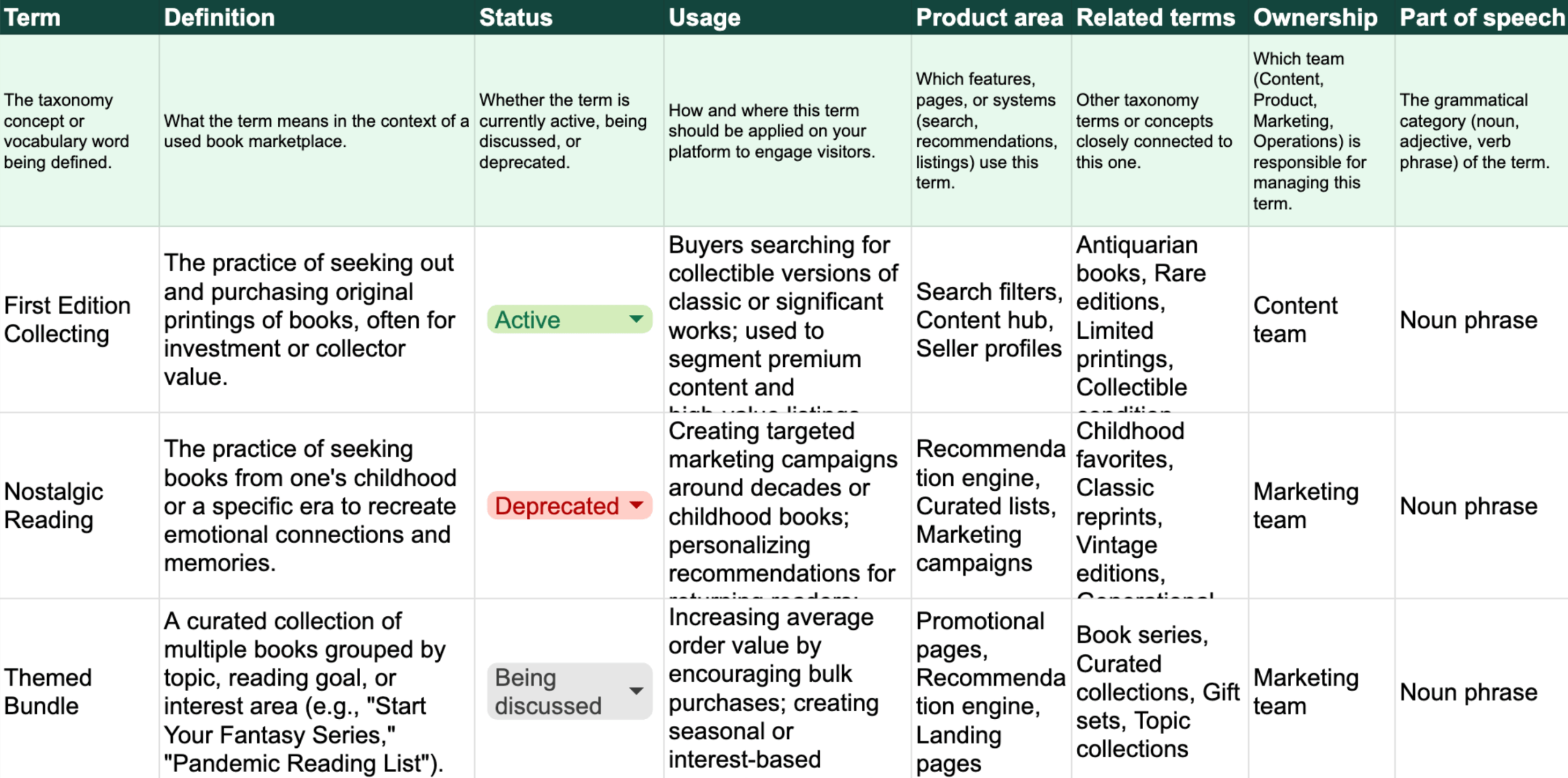
How to build a taxonomy that increases conversions (Spreadsheet template)
Why companies build product taxonomies, where to start, how to structure the spreadsheet, and ways to adapt your product taxonomy to company…
Read post: How to build a taxonomy that increases conversions (Spreadsheet template) -

“But it’s right there on the website!”
What’s behind an unfindable feature for hotel management software?
Read post: “But it’s right there on the website!” -

3 website lessons from HOKA, one of the fastest growing sport brands
HOKA has had a meteoric rise. Here’s how their website information architecture helps them meet growing consumer demand.
Read post: 3 website lessons from HOKA, one of the fastest growing sport brands -

How to organize 3 acquired companies into one coherent website
Company A has acquired Company B, C, and D. How do we organize their sites, for multiple products with different audiences, while…
Read post: How to organize 3 acquired companies into one coherent website -

I finished the first draft of my e-book 🎉
Some fun news: I’ve finished the first draft of my e-book, Accessible IA Fundamentals – A Beginner’s Guide to Intuitive Information Architecture.
Read post: I finished the first draft of my e-book 🎉 -
What is the ROI of user research for content?
Unsure if the ROI of user research for content is worth it? Based on 30+ IA projects, discover when content research pays…
Read post: What is the ROI of user research for content?