HOKA has had a meteoric rise. Their running shoes seem to be everywhere. HOKA’s revenue has grown by 18% since last year. Consumer demand is only increasing, with one in five U.S. adults considering buying a pair of HOKA running shoes in 2026. According to consumer research firm CivicScience, this is the largest year-over-year increase in purchase intent across all running shoe brands.
I’m not the shoe expert—those would be my parents, who have owned and operated Sport Pro Al, a specialized sports equipment shop back home in Albania for over a decade—but I am an expert in websites, and what makes them successful. In this breakdown, I’ll share how HOKA’s website helped them gain significant market share and 3 website lessons that other sports and e-commerce brands can apply to improve their website user experience and increase conversions. Let’s dive in.
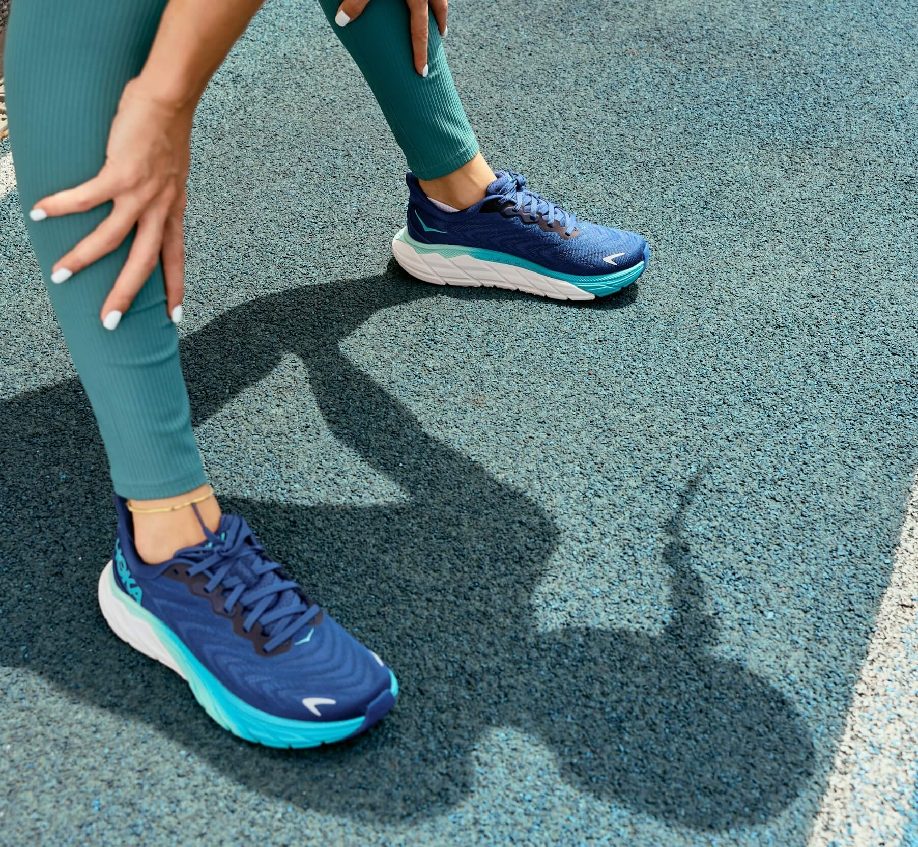
What sets the HOKA website apart:
The company: A maximalist brand loved across gender, income, and age groups
HOKA is a footwear and performance apparel brand. Founded in 2009 in France by Jean-Luc Diard and Nicolas Mermoud, HOKA is known for their comfortable shoes. In 2013, the company was bought by DECK, the parent company of UGG. HOKA is considered a “maximalist“ shoe by all standards: colors, foam, soles, and overall out-there-ness. Nike and Adidas still dominate the market, but HOKA has been steadily gaining momentum, with one in five Americans considering buying a pair.


We talk a lot about personas in my field–identifiable characteristics of our buyers that we can use as guiding heuristics to better serve them–but HOKA purchase intent is almost identical across groups, regardless of gender or income. Since 2023, there’s also been a ~50% increase in purchase intent across older consumers, so the brand is loved across the spectrum.
Almost half buy sports shoes at least two to three times per year. That’s where the website comes in, guiding users to locate nearby stores or purchase directly from the comfort of their home/campsite/van.
The website: A seemingly standard carousel-heavy e-commerce store with captivating imagery

What sets the website apart from a user experience perspective
Horizontal content – multiple ways to find information
In the latest article How to organize 3 acquired companies into one coherent website, I brought up the difference between horizontal and vertical content thinking. Vertical content thinking focuses on a single instance. When we think of content horizontally, we consider different ways the user may be looking for information, not just in a single “important” page, but across touchpoints.
HOKA offers multiple examples of horizontal content thinking.
In filtered results
Website visitors can be casually browsing or have something specific in mind.
HOKA only has 3 types of size 8 vegan women’s shoes with a soft cushion (the “Plush” option under the “Cushioning” filter, which wins UX points for having a visible tooltip that explains the cushion types in clear, jargon-free language).
In HOKA’s online store, after selecting the multiple filters above, users see 3 other things besides the filtered results:
- Mother’s Day gift ideas
- The newest product, Speedgoat 7
- Discounts for Teacher Appreciation Week
These 3 cards offer pathways to timely products and offers without being obtrusive.

Nike doesn’t do this. If a visitor has something specific in mind and Nike only has one product that checks all their boxes, Nike’s filtered results page shows that sole product.

In relevant category landing pages
HOKA website visitors can start their product searches differently, by color, size, or activity.
A user selects the Kids’ footwear category on HOKA’s website menu. Then, in the Kids category landing page, they filter results by color (Blue). After filtering by category and color, users see 2 other things besides the filtered results:
- Little Kids
- Big Kids
Besides the filtering experience on the left pane, these 2 cards offer another pathway to find the right shoes for the kids’ size.
More refined searches return more accurate results, which in turn make visitors more likely to buy.

Note the “relevant“ in the title of this section. HOKA isn’t using these size cards across the board. It would be strange to have callouts to shoe sizes featured so prominently in the Women’s Footwear category landing page. But Little Kids Big Kids is sweet! And sweetness works. If a user selects the Women’s Footwear category on HOKA’s website menu, HOKA uses the same mechanism on the landing page, gently nudging the user to refine their search further. HOKA does this by displaying a carousel of different shoe types. If a user selects a specific shoe type on HOKA’s website menu, though, they see no such cards in the landing page.
Small note: I would love for the imagery to reflect ALL the selected filters, basically, that the Big Kids photo would show a kid wearing blue shoes, and so on (I believe the blue shoe-wearing little kid photo is a coincidence). The amount of tagging and coordination needed would be a lot, but platforms like Bynder exist to help with this kind of stuff.
Surfacing different types of popular filters for items on sale
The concept of ordering items by popularity isn’t new in website design. Old as it may be, social proof works because we’re social creatures who like knowing what others are up to.
What’s special about HOKA’s design is that, first, they show different types of filters:
- three beloved model series (Mach 6, Bondi, Clifton)
- activity (Transport)
- style (Lifestyle)
- product type (Apparel)
Providing multiple information pathways improves discoverability, and a way to do that is by showing commonly used filters across product categories.
Second, their usage of popular filters seems particularly intentional and well-suited for a Sales apge. While a sales collection may attract primarily price-conscious consumers, a user on the Sales page is by definition “just looking“ and prone to overwhelm with hundreds of products to choose from. A quick gateway to what other folks are checking out is guaranteed to kick in some healthy amount of FOMO, and likely provide an interesting selection of product options with minimal effort on the user’s part.

In the search modal
HOKA website visitors start their product searches differently: website menu, homepage, typing in the search box.
After typing a model series like Bondi in HOKA’s search box, a user sees:
- related products (Did you mean?)
- relevant products, if any (Products)
- help links
- company links (History, Technology)
- an invite to join HOKA’s rewards program
HOKA serves these results quickly without reloading the page or requesting the user to hit “Enter“ (which happens with other filtering experiences). The first two sections of related and relevant products are useful for product discovery, save users’ time, and minimize the impact of typos.

Compared to Adidas, HOKA has 5 sections instead of 2, larger photos, filled buttons, and 3 additional product metadata fields (gender, available widths, available colors).
Even though HOKA’s search modal displays more information, I find it less visually cluttered and more helpful than Adidas’ experience. The mix of the typography choice for the bolded words (too bold somehow), the amount of suggestions, and the displayed number of available products for each suggested term (154, 129, 129, etc.) negatively affected how readable and skimmable I found the info.

Authenticity through web design choices
HOKA picks honesty over cleverness.
Calling out where they fall short
After filling out HOKA’s thorough Shoe Finder questionnaire, users see 3 options. Under the products, users see a checklist with 4 items, related to trail conditions, hiking type, cushioning level, and shoe type.
HOKA could’ve chosen to only list the items they can cross off the user’s desired list–“sure, we have shoes specifically for speed hiking“–and conveniently choose to leave out that it’s not the perfect shoe for the user’s weather condition or even the type of shoe they wanted (sandals, not boots).
Instead, HOKA highlights where they fall short (look for the orange X), letting the user know immediately.

Acknowledging risk
How do you spot a fake HOKA store? They created a product authenticity guide to help users spot scammers, including genuinely useful information that can be applied to determine the legitimacy of any other websites they come across.

Knowing what kids care about
HOKA’s website menu for the Kids section prioritizes… color. They don’t do this for any of the other groups.
But kids have favorite colors, and many kids are very, very particular about those colors and what they will and won’t wear.
If nothing else, the decision to prioritize color for this section put a smile on my face.

Created by athletes, for athletes
HOKA was created by athletes. The first few fans of their running shoes were elite ultramarathon runners.
“Originally, we only wanted to improve endurance running times and develop a shoe that would allow you to go faster downhill. In doing so, we unintentionally reinvented the running shoe.“
HOKA co-founders Jean-Luc Diard and Nicolas Mermoud
“Go faster downhill“ sounds much more achievable than “reinvent the running shoe.“ HOKA was created by athletes, and this is both visible on the website and one of the reasons they’re winning so hard.
When a millisecond can make or break your race, dictating future participation in competitions, scholarships, financial security, and professional opportunities, you pay attention to every single detail.
As a former competitive swimmer, I noticed that HOKA pays respect to the details the same way athletes do.
One of the ways they serve athletes is through thoughtful, powerful categories.
You’re a hiker. Great! What type of terrain? Which type of conditions do you hike in: dry, wet, a mix? What’s the weather like where you are: hot, cold, a mix? What type of hiking do you do: day hiking, backpacking, speed hiking?

They’ve thought about stability and cushioning, so the user doesn’t have to guess.

Are you training? Racing? Recoving? They have products to help you in all those phases, and they make it easy to find them.
It comes across through product filters, naming conventions, quizzes, and athlete stories that they want you to succeed, and that they know how important–and fleeting–success is to an athlete.
I didn’t think I’d have so much to say about HOKA’s website, but I’ve been writing for 4 hours straight (stopping every hour to get up and stretch/hydrate/make coffee, of course) and here we are 1794 words later.
I hope you enjoyed this website breakdown of one of the fastest-growing sports brands out there, and got some ideas on how to infuse more clarity and adventure into your company website.