A hospital visit is anxiety-inducing for most of us. Fluorescent lighting, sickness, Lycra fabric, constant mortality reminders. And waiting. So much waiting.
I visited a hospital recently, in search of an explanation for my past thrombosis, medically labeled “weird.” Amidst the turmoil, some of which internal, some purely situational, the general hospital in Vienna (AKH) provided a sliver of calm through their elevator experience.
Vertical transport between levels presents a key conundrum.
People go up. People go down. How do we combine these mutually exclusive realities?
Usually, when doors open, elevator passengers clarify if they’re going up or down. If someone on the ground floor looking to go home to the 4th floor presses the elevator button while someone else from the 5th floor is on their way to the garage, which is 4 floors underground, the person on the ground floor won’t get in since they’re going in different directions.
Besides the one time an elderly Austrian lady yelled at me to get out since her Uber had arrived, the compromise works well with sensible people within the context of smaller residential buildings.
The general hospital in Vienna (AKH), however, is Europe’s 5th largest hospital, treating 95,000 patients every year and employing 9,000 people. You’ll need a lot of coordination, luck, and time to get to where you need to go using the residential approach.
AKH’s simple and effective solution prevents elevator entrances from remaining unusable for long periods.
The hospital’s solution is grounded in a core information architecture principle.
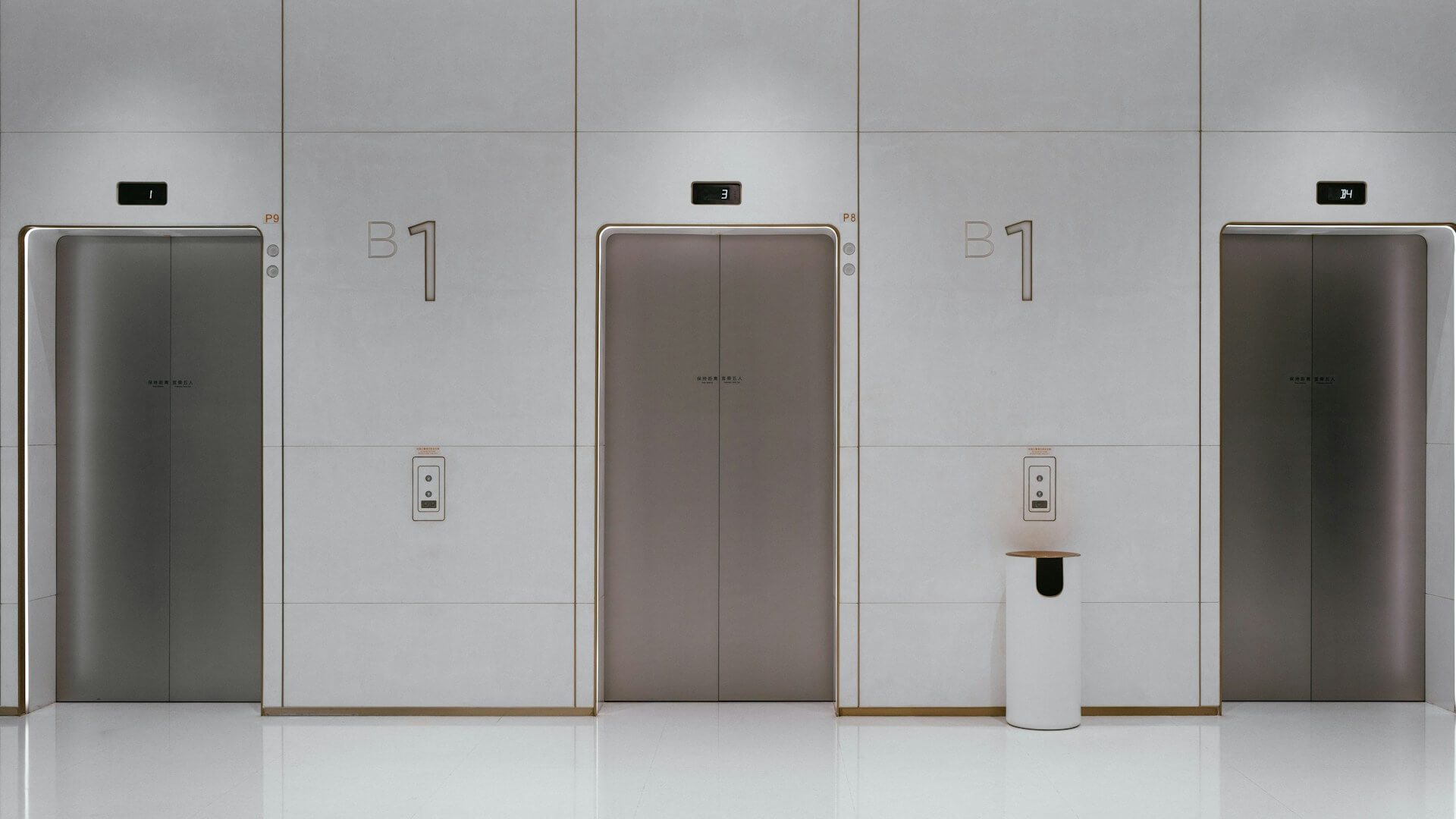
- Near each elevator on each floor of the AKH, there is a screen and a letter (alas, letters as in A, B, C, not hand-written notes placed inside tiny red envelopes).
- A very large font size is used for text and numbers, both on screen and in print, which positively affects readability.
- Patients, staff, visitors, or students select the floor they want to go to.
- The screen displays and announces an elevator letter.
- Everyone going to the same floor at the same time is automatically grouped together and sees the same letter, despite the location of their screen.
- Passengers enter an elevator that doesn’t include a panel of floor numbers, but that takes them exactly where they planned.
Grouping is one of the key principles of making information more findable.
In information architecture, grouping refers to the process of placing similar items together to improve user understanding, fast-track information finding, and reduce cognitive load.
In an elevator context, grouping, the act of separating things or people into groups, serves similar purposes. By selecting their desired floor, passengers are grouped with people who share the same goal. Placing these folks together avoids long waiting times and potential conflicts (“I’m in a hurry,” “I’m also in a hurry” and then cue a crying baby sound). The elevator system gets passengers to where they need to go with minimal involvement required.
Grouping can be as straightforward as helping size 39 EU shoe wearers find shoes that fit by grouping shoes by size. Or having a brunch menu section that lists vegan options.
But organizing information is a skill, and the process isn’t always straightforward.
Exhibit A: diy.com digging, planting & soil care product widths.
There are multiple width options, ranging from 0.1 cm to 360 cm. However, users can’t select a range, which would be the intuitive way to explore this interface, but have to manually select relevant options.

Exhibit B: Canadian Tire width. People have to select each relevant option. Offering width ranges or the option to sort by size would make this easier for users.
The width options aren’t sorted in descending or ascending order, but rather by in-store product availability, which isn’t nearly as relevant to users as it is to the business.

I’d estimate that for every web page, there are 10+ ways to structure information on that screen. And “how do we structure information for maximum findability” isn’t a common refrain (yet!) in most design or engineering rooms.
To learn more about grouping as a product improvement tool, I suggest looking into activities like affinity mapping, card sorting, and tree testing.
These activities don’t have to take too long or cost thousands, and can be done in person or remotely, with your existing users or recruited research participants that fit your criteria.
For example, Gmail staff may not have realized how users think of their inboxes and that they assign groups and priorities to emails without the research that resulted in today’s interface: Primary, Promotions, and Social, with the option to manage purchases, updates, and subscriptions in separate tabs. This may seem small, but our digital spaces mirror our lives, and minimal clutter fosters a clearer mind, whether that’s in a wardrobe or an inbox.
Affinity mapping, card sorting, tree testing, and other information architecture research activities provide an unmistakable peek into how your users think, search, and look for information within your product.
In turn, companies can use that valuable information to guide users seamlessly through their product, reduce frustration, increase conversions, and improve user retention.
AKH’s simple solution prevents elevator entrances from remaining unusable for long periods. Whether your customers are looking for shoes, vegan options, tires, or getting an elevator right when they need it, grouping can be used across interfaces, digital or not, to help users get to where they need to go.
AI Policy: I personally write each draft and final copy on this website. All content reflects my own thinking, ideas, style, and craft. I do not use AI such as ChatGPT or other LLMs to generate articles. Occasionally, I ask AI (such as Formalizer or Equativ) to summarize or re-state my own ideas and may restructure sections based on the response.