After 2 years, my time at my first apartment in Vienna came to an end. This felt bittersweet. Challenging. Tiring. But also extremely exciting. There are so many decisions you need to make, but once it’s all done, the intentionality behind things and spaces and colors is a source of joy. A place feels like your home rather than an Airbnb stay because of all of your decisions, big and small.
I discuss some moving decisions in this article, highlighting observations related to content strategy and information architecture.
AI Policy: All content on this website is written by me. I do not use AI such as ChatGPT or other LLMs to generate articles from prompts or similar. All content reflects my own thinking, ideas, style, and craft. Occasionally, I ask AI (such as Frase or Formalizer) to summarize or re-state my own ideas on the basis of a complete skeleton I’ve written. Based on the response, I may reorder, restructure, or alter my original thinking. I personally write each draft and final copy.
Moving decisions related to content strategy highlighted in this article:
Internet plans – The content strategy of moving
One moving decision involved the selection of an internet service provider. My husband and I were happy with the internet speed from our current provider, but not the price or customer service, so we decided to switch providers when we moved.
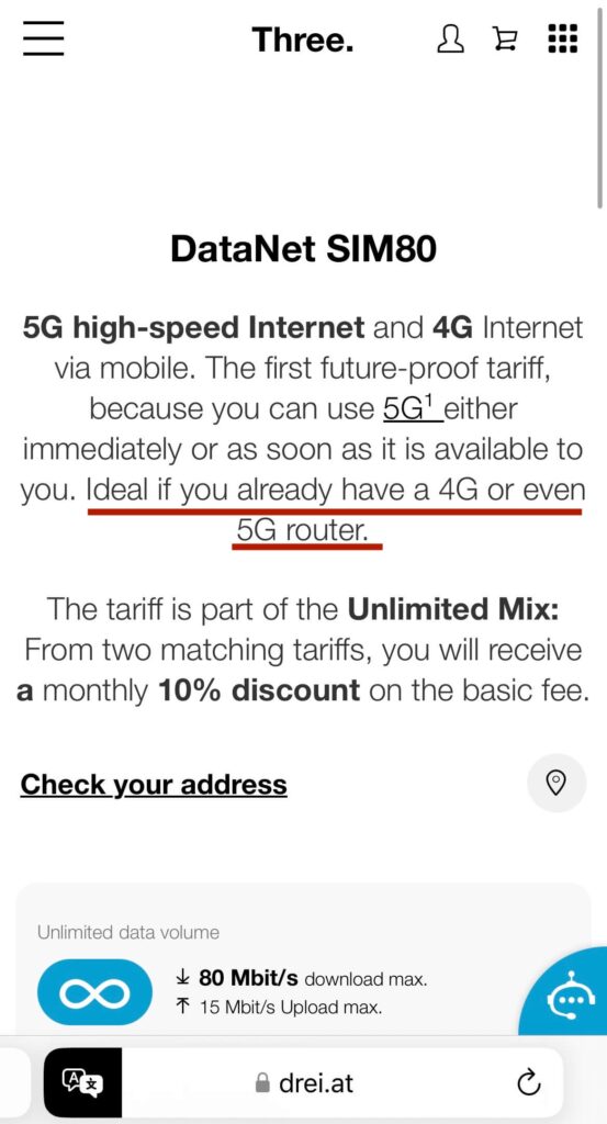
We looked at home internet plans and picked Drei. Their website included prices, speeds, data volume, and contract terms, so we felt confident in our choice, DataNet Sim 80, which cost 25€ monthly.
Unlimited data volume with up to 80 Mbps without a contract. Enjoy 4G internet and, as soon as it’s available, 5G internet.
Going to the store was necessary for setting up a WiFi network, so I went and asked for DataNet Sim 80, but as it turns out, it wasn’t available to me.
What the page said: Ideal if you already have a 4G or even 5G router
What it meant: Only works if you have a router (and you can’t buy one here)
The word “ideal” creates the illusion of choice, making it sound like having a router is a nice-to-have even though it’s required to be eligible for DataNet Sim 80, our desired internet plan.
DataNet Sim 80 didn’t require a 2-year minimum contract (great if we were dissatisfied with the service or moved houses), but other plans did. The router wasn’t available for purchase either, so my DataNet Sim 80 dreams went up in flames.
It’s not that Drei’s other internet plans were horrible; the word “ideal” just implied optionality, thus making it feel misleading and leaving a bad taste in my mouth.
Identifying the core aspects of a client’s business model is one of my primary activities during the discovery process.
It’s common to make assumptions here based on personal perceptions, especially based on what the client’s websites say, but marketing materials aren’t always accurate portrayals of the bread and butter of their business.
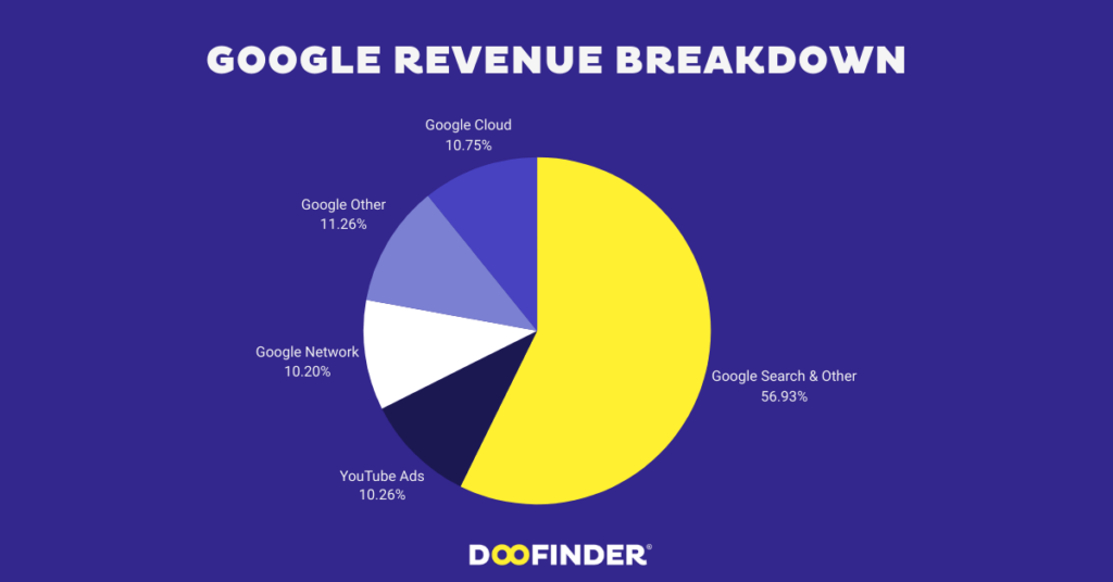
Some team members may have an opposing or incomplete view of revenue sources and who matters most for the business. Engaging in these discussions is vital for ensuring alignment and preventing decisions based on partial or inaccurate information. For example, I was surprised to see that YouTube only makes up 10.26% of Google’s revenue.
Engaging in these discussions is beneficial even within the non-profit sector, particularly when they’re guided by financials and analytics, to ensure we’re helping those who require our support the most.
Additionally, there may be an internal shift in product strategy that has not yet been rolled out publicly, along with a preference to avoid explicit associations with particular industries or companies.
A primary responsibility of my role as an information architecture consultant involves reviewing copy for clarity. I could choose to review each page and interaction, but I believe this isn’t the most efficient use of the client’s time and resources. Instead, I focus the audit on the site structure and content related to clients’ main offerings to identify gaps, redundancies, and opportunities for improvement, knowing that will have the biggest impact on the bottom line and UX.
Like I said, it’s not that Drei’s other internet plans were horrible, but the word “ideal” just implied optionality, thus making it feel misleading and leaving a bad taste in my mouth, which I’m hoping to avoid as much as possible for my clients.
Reviewing copy for your main offerings every few months ensures your clients see up-to-date, accurate information. You’re making it easy for potential clients to choose you. They can also easily identify when your products don’t align with their current needs, which is equally important.
IKEA returns – The content strategy of moving
In recent months, I’ve started gluing receipts of memorable dinners, cinema dates, museum visits, and YouTube-worthy grocery hauls into my journal. Yes, some grocery runs are more special than others, sorry, I don’t make the rules.
Generally, though, I despise receipts. What am I supposed to do with it?!
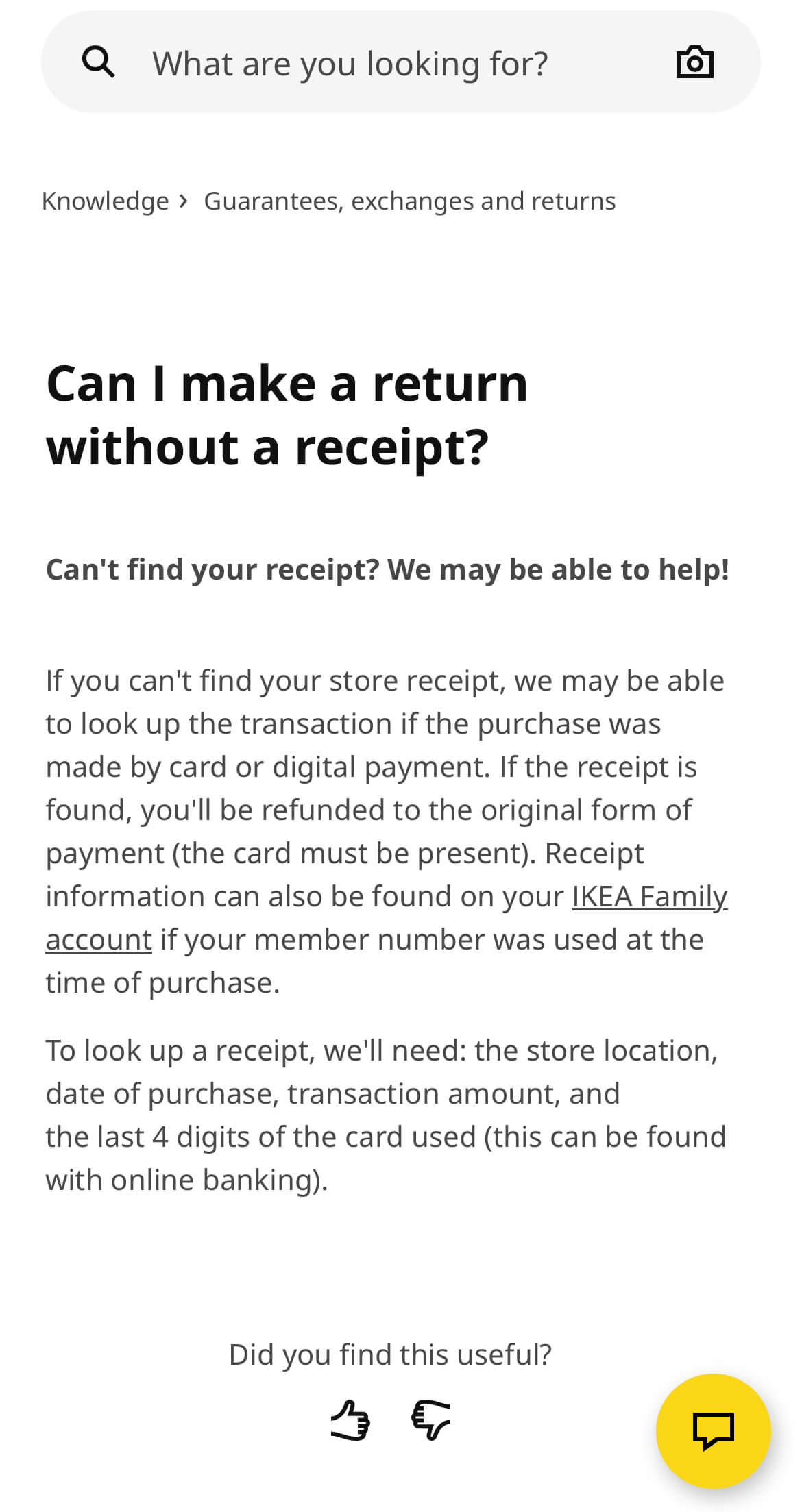
For that reason, I love that Ikea, a company I’ve greatly depended on for the move and visited probably 20 times in the past month, provides the option to return items without a receipt.
If I were doing a content audit of IKEA’s return experience below, the “What’s going well” section of the audit would include:
- The copy is user-centric since it addresses a common user challenge: misplacing a receipt before recognizing the need to return an item.
- The copy is user-friendly because it’s tailored to the user’s perspective and reflects the natural language they would use in their searches, “Can I make a return…?” vs “Here is the process for IKEA customers to return an item”.
- The user-friendly language makes this information accessible and easy to find on search engine results.
- The copy follows IKEA’s brand identity copy guidelines related to clarity, accessibility, and tone (starting at page 43). For example, “Can’t find your receipt? We may be able to help!” is conversational in nature, helpful, and clear. The pacing, word choice, and structure all make IKA copy casual and natural.
- Showing prerequisites and next steps reduces friction and frustration, ensuring a smooth experience for users. The copy clearly outlines requirements for getting a refund for customers without a receipt. The copy also outlines next steps (“If the receipt is found, you’ll be refunded to the original form of payment…”).
- Understanding performance is an essential component of all content-related initiatives. You’ve already set up a website feedback widget where users can answer whether they found the page useful (yes/no), which is a great tool for assessing content effectiveness and identifying areas for improvement or further testing of underperforming content.
- The help center article concludes with a list of related questions, which is beneficial for customers who didn’t find the information they needed and eliminates the necessity to perform a new search.
- Our way of doing things could be limiting or difficult for users. When there are multiple ways to perform a task, ensure not to enforce a single method. For example, the copy mentions another method for customers to find receipts and make a return (through their IKEA Family account). Additionally, the copy aids users by using clear hyperlink text (IKEA Family account vs Click here) and including the link directly in the help center article, reducing unnecessary steps for customers.
- ⭐ For going the extra mile ⭐ One example of this is guiding users on how to locate the last 4 digits of the card used for online payments, which is surprisingly a different process than looking at the numbers on the physical credit card.
Buying furniture – The content strategy of moving
Non-English text tends to be 50% longer than English text.
Tekstet jo angleze kanë tendencën të jenë 50% më të gjatë se tekstet në anglisht.
The Albanian translation of the sentence is longer. When building products for a global user base, it’s essential to consider localization strategies. Localization is the process of adapting products (text, visuals, features) for different locations to make them a good fit culturally.
“When interfaces are localized, the content will often expand in length. In most languages, text is up to 50% longer on average than English. Some non-Latin languages, such as Japanese, take up more vertical space. For character-based languages, text wrapping and line breaking can’t always rely on spaces to separate words.”
Shopify’s design system Polaris
I thought about localization when I was purchasing a shower rod (or a Duschvorhangstange) for the new apartment.
I saw an alert on the furniture store’s website for 20% off bathroom accessories with the code bag. Bag. I can do that. That’s a good coupon. “887bag-1” is a bad coupon.
I added the code, but I got an error message saying the voucher code didn’t exist. I tried all caps, no caps, with quotes, and without quotes.
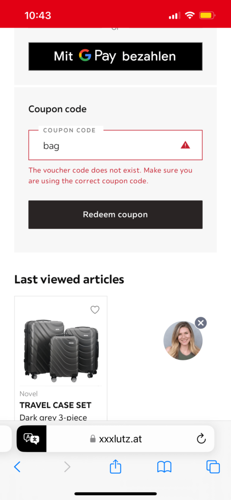
Information architecture and content organization came to mind. A shower rod is a bathroom accessory, right? Right?! Technically, an accessory is “a thing which can be added to something else in order to make it more useful, versatile, or attractive.” Were they referring to an accessory as a thing that visually enhances another thing, like earrings complement an outfit? Our previous shower curtain was actually a colorful diva that enhanced the bathroom esprit, but I never considered the rod a dignified visual component of the bathroom. I never considered it, period. Maybe there were colorful diva shower rods out there, and I had missed out on this vibrancy all my life. Oh. Hold on. No pun intended. I was reading the automatically translated site in English. Would I get another code if I translated the site back to its original German version?
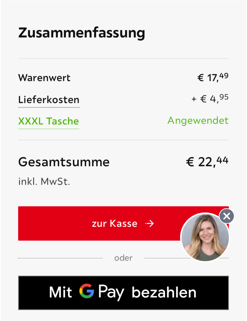
I did. The code bag didn’t work not because it didn’t exist, but because I was adding it in the wrong language. I typed tasche instead. The discount appeared on the screen in green. I’m in my bag is out. Ich bin in meiner Tasche is in.
These were some of my content-related observations during the move.
I also had fun experimenting with different content formats for Little Language Models last weekend.
Based on the face-to-face conversations I’ve had since launching my business, I’ve realized that words like “content design” and “information architecture” don’t mean anything to most people, so I’ve had to shift gears.
The concept for this set (there are 4 more coming) was to pick a few metaphors that are easy to understand and align well with my work, using strong visuals and starting with moving and home organization, the experiences being top of mind since I recently moved.
Not a moving company. A company that can move your content in the right direction. Minimum overwhelm. No broken things. Just organization that makes sense.
Email [email protected] for support on getting you where you need to go.

You want your project to succeed, but the website is standing in the way.
Your website’s visual branding is on point. The site runs smoothly, tech-wise. Yet it’s a sensitive topic within the company.
Things are hard to find. Your colleagues have to answer the same questions over and over.
The team publishes and updates content frequently, yet you keep getting complaints that people can’t find what they need.
🪄🪄🪄 Envision the following scenario…
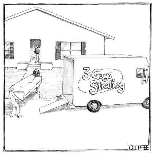
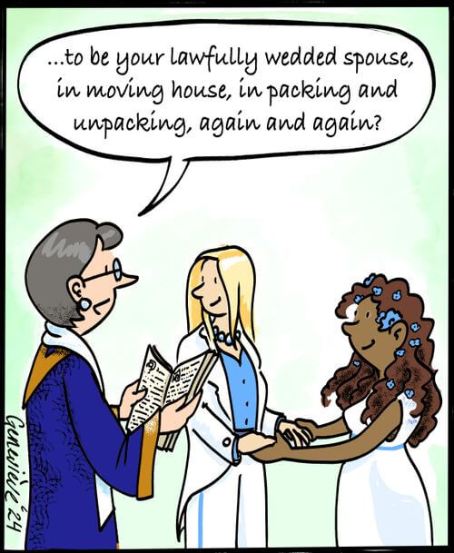
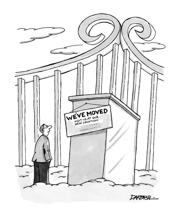
If you’ve moved recently, congrats and a huge kudos to you. Enjoy some of my favorite moving cartoons.

Leave a Reply