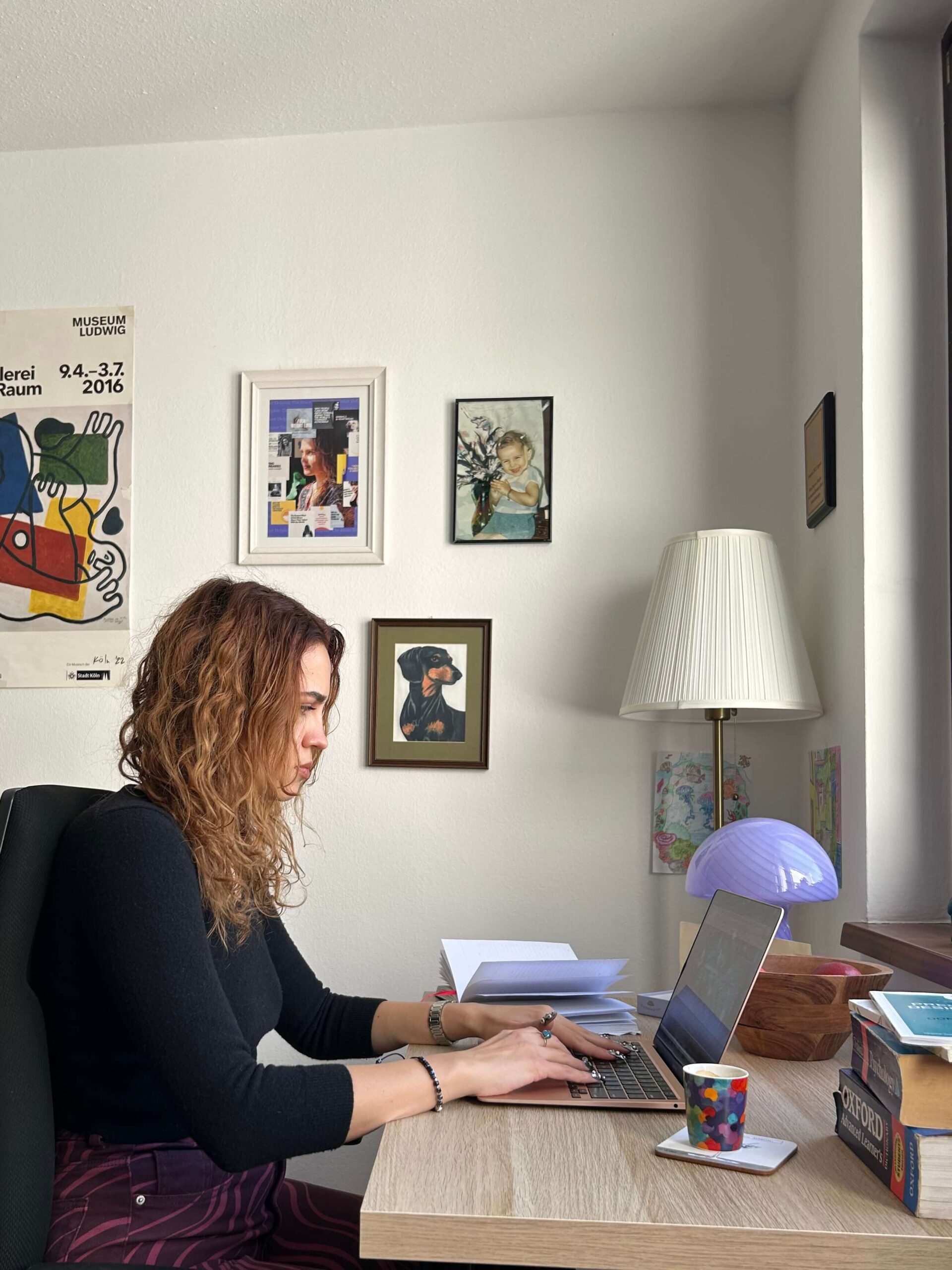
I was on a video call with a client when I heard a third, unidentified voice behind me.
“I’ll need this meeting booth in 5 minutes.”
During the 6-month career break that I took last year to reflect on what was next while deeply enjoying what was there for me in the present, one of the things I realized was that I needed a separate physical space for work. I didn’t want to keep working from home, so when I returned to the work world in January, I got an office at a coworking space.
Someone from the coworking space had entered the meeting booth I was in to notify me that they had booked it and I would need to leave in 5 minutes at most.
It was my fault. When I checked the app, the booth was available, but I didn’t book it.
The booth was by the ladies’ bathroom, and I frequently saw a green light 🟢 indicating availability in the tablet outside the room, even when people were inside having calls, which meant they hadn’t booked through the app. I figured this was okay, but it wasn’t.
I apologized and found another spot to continue my meeting.
When he finished his call and returned to the main shared space, I apologized again.
With contempt, he said, “It’s fine, but you know, it is just 5€ to book it…”
Besides rent, the owners of this coworking space also required additional payments if you wanted to have plants, bring guests, or book a booth (10€ per hour), the latter being what I assumed the person was referring to.
I didn’t say anything.
An hour later, I walked by the booth and saw green 🟢. He was in there. He was having a call. In a booth he hadn’t booked. After scorning me for doing the same.
I tried to think of the most generous interpretation of this event, but I soon set that aside in favor of appreciating the humor and complexity inherent in human nature. Why are we like this?!
In honor of taking “Do as I say and not as I do” to the logical extremes, here’s a list of counterintuitive navigation UX choices I’ve made despite advising others against doing the same.
AI Policy: All content on this website is written by me. I do not use AI such as ChatGPT or other LLMs to generate articles from prompts or similar. All content reflects my own thinking, ideas, style, and craft. Occasionally, I ask AI (such as Frase or Formalizer) to summarize or re-state my own ideas on the basis of a complete skeleton I’ve written. Based on the response, I may reorder, restructure, or alter my original thinking. I personally write each draft and final copy.
6 counterintuitive navigation UX choices highlighted in this article:
Hiding “Sign in” – Counterintuitive UX choices
- Have we worked together for over 6 months?
- Have you arrived more than 2 minutes late to a scheduled call for which you were the meeting host?
You’ve seen this gif already!
Zoom shows a “Waiting for the host to start meeting” message on the screen when the host hasn’t arrived yet.
Similar feelings arise when companies create obstacles for users attempting to access their platform.
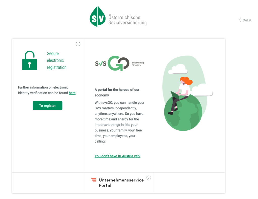
I always get confused when I try to log in to SV, my healthcare insurance provider. I’m not trying to register. I do have ID Austria. Unternehmensservice Portal is accessible, but it doesn’t open my SV profile.

I hid the “Sign in” button for a client by only placing it in the footer.
Project: Financial services firm replatform
Rationale: Considering the aggressive timeline (2 weeks), I relied on async comms and low-fidelity designs focused on business goals and key user actions. Business owners looking for investors were the site’s main audience. The website had limited functionality. The clunky back-end interface turned editing and adding content in the CMS into a chore for admins.
I focused on business owners and simplifying content management for admins. The “Sign In” button allowed investors to access a portal with the latest info. However, investors preferred to receive this information through different formats like investor update emails or slide decks. Investors weren’t accessing the main site that frequently, but they’d still be able to sign in; it just wasn’t a key goal of the website, which is why I deprioritized it in the content hierarchy.
Having cryptic names in the navigation – Counterintuitive UX choices
Something you’ve likely experienced more than once when visiting a website is seeing names like these in the menu: Analytics Keep, Pro Series Analytics Tool, Analytics Hybrid, usually listed under Products.
You and I don’t know what they mean, but they’re extremely clear to the people who work on these products, coincidentally, the ones who decide what goes in the main website navigation. A software engineer working on Analytics Keep has seen references to it every morning for the past 4 years when they’ve opened their computer and accessed Slack, GitHub, or the company’s HR platform.
User-facing navigation structures that simply duplicate obscure product names are very common. Reusing internal jargon is an abdication of responsibility that someone, somewhere, is suffering the consequences of, whether that’s the brand team, customer service reps, or sales. Ambiguous names are one of the reasons why testing with users is important. They will tell you what they’re confused by! That’s pure gold right there.
I put a cryptically named NounParty 24/7* item in a client’s website navigation.
*not the real name
Project: Public library website redesign
Rationale: The NounParty 24/7 item carried a lot of brand equity. Investopedia defines brand equity as “the value premium that a company generates from a product with a recognizable name, when compared to a generic equivalent.” Residents knew about the event, even those who had never visited any of the library locations. Patrons were excited and had built a tradition around the event. I’d be applying UX best practices if I modified the label name to one that was clear and intuitively understood, but it wouldn’t be the right choice.
Duplicating content – Counterintuitive UX choices
Time.
Attention.
Amount of popcorn I can eat without getting painful microcuts on the roof of my mouth.
These are all limited resources.
We want every word or action on a platform to serve a purpose that makes user and/or business goals easier to reach, whether it’s building trust, answering a question, simplifying onboarding, or increasing retention. This is why I generally recommend avoiding duplicated content.
Duplicate content is also hard to maintain and often falls through the cracks, resulting in outdated, incorrect information that can frustrate or mislead users.
I repeated the same term 4 times on a client’s website navigation.
Project: Pathology clinic website redesign
Rationale: This clinic engaged clinicians with state-of-the-art diagnostic expertise, proficient in diagnosing complex conditions. Besides their services, the clinic offered 250+ tests. Building a powerful, searchable, and easy-to-use test directory was one of the main goals of the website redesign. This was the reason why I decided to highlight the test directory as its own level 1 item as well as a level 2 item under all 3 of the main pathology specialties, which would take visitors to the test directory filtered by specialty, i.e., Neuropathology tests.
I also included tests as a custom post type in the content model so they could be added automatically to multiple touchpoints, and users could easily find them whether they were visiting a lab or a subspecialty on the site.
Encouraging users to leave a website – Counterintuitive UX choices
External links in the navigation provide users with the option to leave the site, which may result in decreased return visits.
I prioritized an item in the website navigation that would take users to another website.
Project: B2B resource center of a major consumer electronics corporation
Rationale: An effective navigation generally doesn’t surprise users by taking them to external URLs without cues. External links per se aren’t terrible, but they should be used sparingly and intentionally. I added a big, shiny button labeled Shop now in the client’s website navigation that would take users to the e-commerce site. Since analytics showed that a lot of first-time visitors landed on article pages through product-specific searches, I wanted to highlight the e-commerce site for those looking for deals for business customers.
I also created a Product custom post type, enabling writers to “tag” articles with specific products. This functionality allows visitors to view key product specs at a glance and provides a direct link for purchasing.
Format-first navigation grouping – Counterintuitive UX choices
Some companies group resources by format: White Paper, Videos, Infographics, Assessments, Calculators.
It may be industry-dependent, but at least in the information technology sector, research (not publicly available) has shown that users don’t prefer format-first categorization.
This implies that users may not actively seek out a white paper or video specifically from your company blog. Relying heavily on formats for resource filtering could potentially harm your content efforts.
I proposed format-first navigation grouping to a client.
Project: Prestigious law review
Rationale: Brand equity, like in the previous point on cryptic names in navigation, drove my choice. The format-first grouping of their publications aligns with user expectations and upholds the review’s esteemed over 100-year legacy.
Spending ~10 hours total on UX for a client project – Counterintuitive UX choices
In 1793, the French tried to make 10-hour days a reality. The French Revolutionary Time was a short-lived concept where each day lasted 10 hours, with 100 minutes per hour, and 100 seconds per minute.
10 hours isn’t a long time by most people’s standards. It’s a workday if you have a deadline coming up that you totally didn’t forget about.
It can’t be enough to review the existing navigation, prepare for workshops and interviews, design how users can navigate a website, and iterate based on feedback from testing and stakeholders at the FAANG company. It certainly can’t be enough to also create a content wireframe showcasing content elements in a hierarchy. Right?
I wrapped up a UX project for a FAANG in 10 hours.
FAANG is an acronym for the five best-performing American tech stocks in the market: Meta (formerly Facebook), Apple, Amazon, Netflix, and Alphabet (Google’s parent company).
Project: Real estate greenfield project at a FAANG
Rationale: Any project that a team starts from scratch without constraints from previous decisions is considered a greenfield project. This term draws an analogy to construction activities conducted on undeveloped land.
The FAANG team wanted to write a request for proposal (RFP) for development services for their new greenfield initiative. However, they didn’t have sufficient detail regarding the necessary functionalities to accurately define the scope of the RFP.
I focused on building a minimum viable product (MVP), which is ideal for greenfield projects. An MVP is an early version of a product used to get feedback for further development. I created a navigation structure and wireframe for the key user journey to help define the scope and find the right technical partner to develop the FAANG site.
This was my list of counterintuitive navigation UX choices I’ve made despite advising others against doing the same.
Heuristics like best practices are helpful and save us time, but their effectiveness relies on critical thinking and context consideration.
“Learn the rules like a pro, so you can break them like an artist.“
– Dalai Lama – Michael Scott – Delfina Hoxha

Leave a Reply