Let’s say you work for a big public library with millions of items: books, DVDs, newspapers, research articles. The library also organizes weekly events and offers different courses for patrons.
You’re a member of the team responsible for the successful redesign of the website. You’ll collaborate with internal stakeholders and the external agency hired to build the site. This is a high-visibility, high-stakes project. Everyone seems to have an opinion on what should and shouldn’t go on the site. You’re not really sure what to watch out for in a project like this, especially given the extensive amount of information involved.
If you’re in a similar situation, this article is for you. As a lead content designer who has worked with tech startups, leading agencies, and F50 companies, I’ve led the information architecture redesign of 30+ websites and applications. The number of mistakes I’ve made along the way is only surpassed by the amount of opinions I now have on IA. These experiences were not in vain (or so I like to believe) since I can now share them with you, and hopefully help you avoid the same problems.
There are 6 main disciplines involved in a website redesign: strategy, project management, content, design, development, and quality assurance (QA).
Depending on the agency, there’s some overlap between the disciplines and who’s doing what. For example, design may include content designers and visual designers. Developers or PMs can do QA.
Information architecture usually falls in the design camp and is done by a content designer or user experience (UX) designer. IA is the practice of structuring information.
Integral components of Information Architecture include:
- Sitemaps – the public-facing structure of the website, including the navigational menu and footer
- Content modeling – the technical structure intended for internal use only, depicting the various content types and their interrelationships within the site
There are many aspects to making a website redesign successful. I’ll focus on one aspect of the work, information architecture design, and common mistakes to watch out for, but also include general web design faux pas I’ve encountered/done.
AI Policy: All content on this website is written by me. I do not use AI such as ChatGPT or other LLMs to generate articles from prompts or similar. All content reflects my own thinking, ideas, style, and craft. Occasionally, I ask AI (such as Frase or Formalizer) to summarize or re-state my own ideas on the basis of a complete skeleton I’ve written. Based on the response, I may reorder, restructure, or alter my original thinking. I personally write each draft and final copy.
In this article:
Common information architecture problems
- 1 – Going straight to building
- 2 – Not setting goals
- 3 – No research or data
- 4 – Being overly attached to content
- 5 – Conway’s Law symptoms
- 6 – Untimely information
- 7 – Unintuitive groupings
- 8 – Content hierarchy doesn’t align with user interests
- 9 – SO many dropdown items
- 10 – Multiple menu styles
- 11 – Overlooking other navigation alternatives besides the menu
Common content modeling problems
Common information architecture problems: what to watch out for
1 – Going straight to building
This usually happens when the company has finalized their brand identity, which includes typography and color palettes, and is eager to take it on the road. They’ve planned time for developers and copywriters. Developers start building the new site. Copywriters may add the copy in the pages once developers have built them.
Vienna has 37 public libraries. Each location page will look wildly different if there’s no consensus on the structure of these pages before the copywriters dive in.
- Some locations will show accessibility information, some won’t. Some will show children’s programs, some won’t.
- Users will be able to filter books by language on some location pages, but not in others.
- Some locations will “sound” very formal, others will employ a more casual writing style.
There’s no common thread of strategy which can make the final experience feel fragmented. Because it is.
2 – Not setting goals
Sticking with the library example, every team may want to highlight something different on the website. Events. New books. The free services they offer to citizens. Their location and opening hours. Someone thinks the site should be a brochure website, one page showing where the library is and when it’s open.
“We should promote in-person interactions. Our librarians are so helpful and knowledgeable, they can answer all their questions and provide personalized recommendations.”
The homepage is especially a political minefield. Everyone wants a slice of the homepage (despite data consistently showing that homepages are overrated).
Related to the point above, starting with clear goals will save build time and headaches. The strategy impacts what gets prioritized.
3 – No research or data
Let me tell you a story.
I almost infuriated a lot of people on a recent project. Thousands.
Death and libraries? Who could’ve guessed? Not me.
I was the lead content designer for a website redesign of a leading public library system in the US. Founded in 1869, the library had a rich history and offered generously to patrons. I heard from patrons and stakeholders. Employees found pride and enjoyment in working for the library. Residents loved the library. Their passion was contagious even though I was already infected with a strong admiration for public libraries since getting my card 2 years ago and reading 22 books in a year.
Despite talking to library patrons and staff stakeholders, if I hadn’t looked at the data, I would’ve pissed off a lot of people.
Google Analytics is an analytics tool that can tell you about website visitors’ behavior. I was surprised that the site’s third most visited page was something I hadn’t heard about before, but not as surprised as I was when I clicked on it.
The third most visited page on the site, visited by thousands of users every month, contained… death notices. This necrology file contained local cemetery records and newspaper obituaries dating back to 1833.
Apparently, the library served as a database of death records in the area during earlier years and a place for residents to request obituaries. Stakeholders confirmed this, but were taken by surprise by the significance of these resources to patrons.
- If it wasn’t for analytics data, the necrology directory URL could’ve been easily overlooked in the content inventory spreadsheet that’s used to track migration decisions
- The directory wasn’t displayed in the main website navigation, so users had to rely on search; knowing this ensured that we had carefully considered the desired search experience for thousands of users
- The directory had thousands of entries; knowing this allowed engineering partners to assess migration feasibility early on, which turned out to be crucial due to unexpected complexities and the need for a specific loading method.
- Thousands of residents would lose a valuable resource if we had overlooked the data.
A word on public libraries in the US
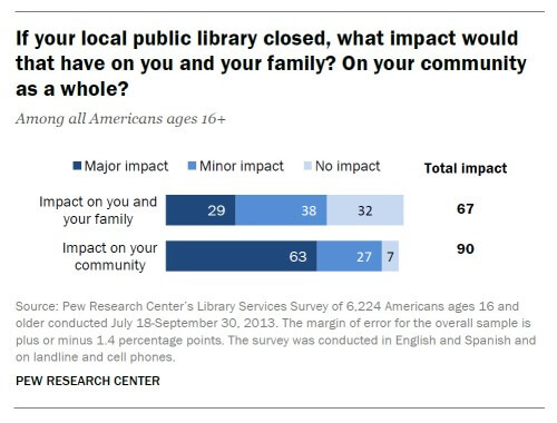
63% of Americans ages 16 and older said that the closing of their local public library would have a major impact on their community.
If you’re not from the United States and are wondering if it’s a common responsibility of public libraries to archive obituaries or to provide various services to the public, and whether these services are available elsewhere, I was surprised by the crucial function public libraries serve within communities, particularly in areas with lower socioeconomic statuses and literacy levels. Americans say public libraries “play an important role in giving everyone a chance to succeed.” #SupportYourLocalPublicLibrary

4 – Being overly attached to content
Delete. Delete. Move to trash.
Little Language Models is my ode to more isn’t always better. The idea to use the domain for an agency that’s intentionally minimalistic and deliberately committed to staying that way came to me randomly at an airport, but it felt so clear I had to listen to it. Only two services offered, simple interfaces, clear language, and a website experience that doesn’t frustrate people.
Clients are reluctant to remove content, but less is better – for your users, for your employees, for our planet, for your budget.
Removal success stories from Gerry McGovern
Gerry McGovern is the creator of the Top Tasks methodology (a personal favorite) and a great proponent of the “more isn’t always better” philosophy. He shares these success stories of how focusing on top user tasks and deleting everything else helped organizations:
- The Norwegian Cancer Society reduced their website size from 4,000 down to 1,000 pages. Donations and satisfaction rose substantially as a result.
- Liverpool City went from 4,000 pages to 700 and saw lots of positive results.
- Telenor Norway went from 4,000 to 500 pages. Sales and customer satisfaction went up. Customer support inquiries went down.
“Giving a website to an organization is like giving a pub to an alcoholic. Every hour is Happy Hour as they publish, publish, publish. Designing apps is pretty much the same, as ‘featuritis’ spreads rapidly. Typically, when organizations delete up to 90 percent of what they have, everything begins to work much better.” – Gerry McGovern
5 – Unknowingly, albeit consistently, implementing Conway’s Law
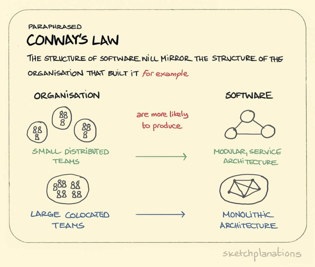
Conway’s Law is the theory that an organization’s systems will copy the organization’s structure.

It’s hard to find more obvious demonstrations of Conway’s law than in information architecture decisions.
Non-library example incoming 🚨 I was responsible for improving staff efficiency and reducing user frustration for an American multinational energy company by optimizing contact form design and accessibility.
The IA challenge
The company received thousands of email inquiries every week. After a website redesign, users kept sending questions to the wrong departments, resulting in delayed responses and frustrated clients.

Research
To create a holistic view of copy performance, I’d have to use different tools and collect quantitative and qualitative data. Using Hotjar, I generated heatmaps. Heatmaps are a visual representation of data where user behavior and scroll depth are depicted by color. I manually reviewed the experience and watched some screen recordings to see where users were looking, clicking, or getting stuck. I also looked at Google Analytics path exploration data, filtering for visits starting or ending on the contact page.
Defining the problem
There were several user experience issues, notably that users faced challenges stemming from… Conway’s Law! Users could choose from 7 different reasons for their inquiry. The naming convention was inconsistent, though. Both roles (Board of directors, Marketing, Corporate secretary) and topics (Sustainability, Community investments) were used as inquiry categories.
They were using internal structures outwardly. While this routing was important for the company, so someone in the marketing team could receive branding assets inquiries, it was frustrating for users. Why did they need to figure out the job title or department of the person who could answer their question?
The opportunity
Acknowledging Conway’s Law, the theory that the architecture of an organization’s systems mirrors its organizational structure, can help fix user experience issues by addressing the overarching issue of organizational silos.
Users could easily find the right topic category to classify their issue. This would positively affect customer satisfaction, time on task (contact page → question submitted), and response times.
The company could still use topic-based inquiry categories to send questions to relevant departments without users needing to map organizational charts.
6 – Untimely information
The navigation isn’t generally* the place to get specific (*unless your infrastructure is set up to have easy-deployable micro-instances where each instance serves an ultra-specific purpose and audience).
Many stakeholders want to add, add, add to the navigation, an impulse stemming from the fear of users missing something stakeholders deem important.
If someone’s interacting with a product or service for the first time, usually they don’t want to know everything about it (*usually is doing a lot of heavy lifting here – if my favorite author has a new book out, I want to know everything about it and I’ll look for interviews and Reddit threads and Goodnotes reviews and IG photos).
obscure internet reference incoming: what happened internet scouring-ally after I read My Year of Rest and Relaxation can never happen again
The information’s amount, thoroughness, and format should be suitable for the current stage of interaction.
- I don’t want to spend 30 minutes filling out a form for an author Q&A if the event is fully booked.
- If I’ve been a member for 10 years, I don’t want you asking me to sign up for a membership.
- If it’s my first time on the site, I don’t want to be asked to donate 3 times during my website visit.
- Please don’t make me watch a video to open an account. Or do anything, really. Please. #ProudVideoHater
In a recent information architecture consulting project, the client’s portal featured a guide in the Read this first section. I have to read this first, I thought. It was 1500 words. If the amount of information isn’t suitable for the stage of interaction, it may lead to feelings of overwhelm for new users instead of fostering a sense of preparedness and competence, which is what we want.
7 – Unintuitive groupings
A library website featured Subjects & Collections under About us. Users might not know to look for research collections under About us since it doesn’t match their mental models.
“A mental model is what the user believes about the system (web, application, or other kind of product) at hand. Mental models help the user predict how a system will work and, therefore, influence how they interact with an interface.”
Megan Chan, Nielsen Norman Group
Users’ mental models for an About us item in the navigation include items like: Company, Mission, People, Careers, News, Contact.
Unintuitive item groupings are among the most common IA issues. What usually happens is that a team member insists on having an item in the navigation. It gets added reluctantly. The situation repeats itself a few months after, then again and again, until the navigation becomes ungovernable. Card sorting is your strongest ally here.
8 – Content hierarchy doesn’t align with user interests
If an item is the first element in the navigation, it’s reasonable to assume that it’s highly relevant to user needs and/or company goals.
This isn’t always the case.
A client’s website navigation displayed 2 items that, upon Google Analytics inspection, were identified as the 55th and 87th most visited pages on the site. These pages don’t belong in the navigation, but this hierarchy mismatch issue is rather prevalent.
9 – SO many dropdown items
The terms displayed in a website’s navigation represent the level one (L1) items.

Hovering over a L1 item displays L2 items.

Some sites have more than 10 L2 items. Some sites have more hierarchically nested levels and go up to 5 levels.
The paradox of choice indicates that a wide range of options can lead to increased difficulty in making a decision and may result in dissatisfaction with the selected choice.
10 – Multiple menu styles
The website navigation for each library location may have its own unique style, both in terms of visual presentation and language. This can create a sense of disconnection, as if users are visiting multiple sites.
A library may have multiple digital touchpoints:
- hours & locations library info
- events
- e-books and audio books
- book wishlist and upcoming book deadlines
- press reader (newspapers and magazines)
- research collections
- blog
Again, these may all have different visual and verbal menu styles, which causes user confusion. Sometimes decoupled instances are easier to implement and maintain from a technical perspective; however, this is frequently a Conway’s Law symptom.
11 – Overlooking other navigation alternatives besides the menu
The menu serves as a method for navigating a website; however, additional options are available, such as:
- Search box
- Find on page function (Ctrl+F/Command+F)
- Website footer
- Headings and anchor links
- Breadcrumbs (the path users have taken so far)
- Previous/Next buttons (chronological pointers at the end of every page, common in documentation)
- Help centers
- Scroll back to top button
- Chatbot
- Asking large language models (like Google’s AI overview or ChatGPT) for summaries
I mentioned earlier that I was the lead content designer for a website redesign of a leading public library system in the US. When I looked at analytics data, many search terms were unexpectedly verbose or rich in metaphor.
You might be thinking, what’s surprising about the presence of literary prowess in library patrons?

It turns out that thousands of people were searching for book titles on the library website. The book database, however, lived on an external platform so a book title search on the library website wouldn’t return any results. Consequently, users likely thought the library didn’t have the books they were interested in.
These touchpoints shouldn’t exist in a vacuum, as they often do, but function together as part of an interconnected ecosystem.
Common pitfalls in content modeling differ from those related to user-facing navigation information architecture, so I’d like to address them too.
About content modeling
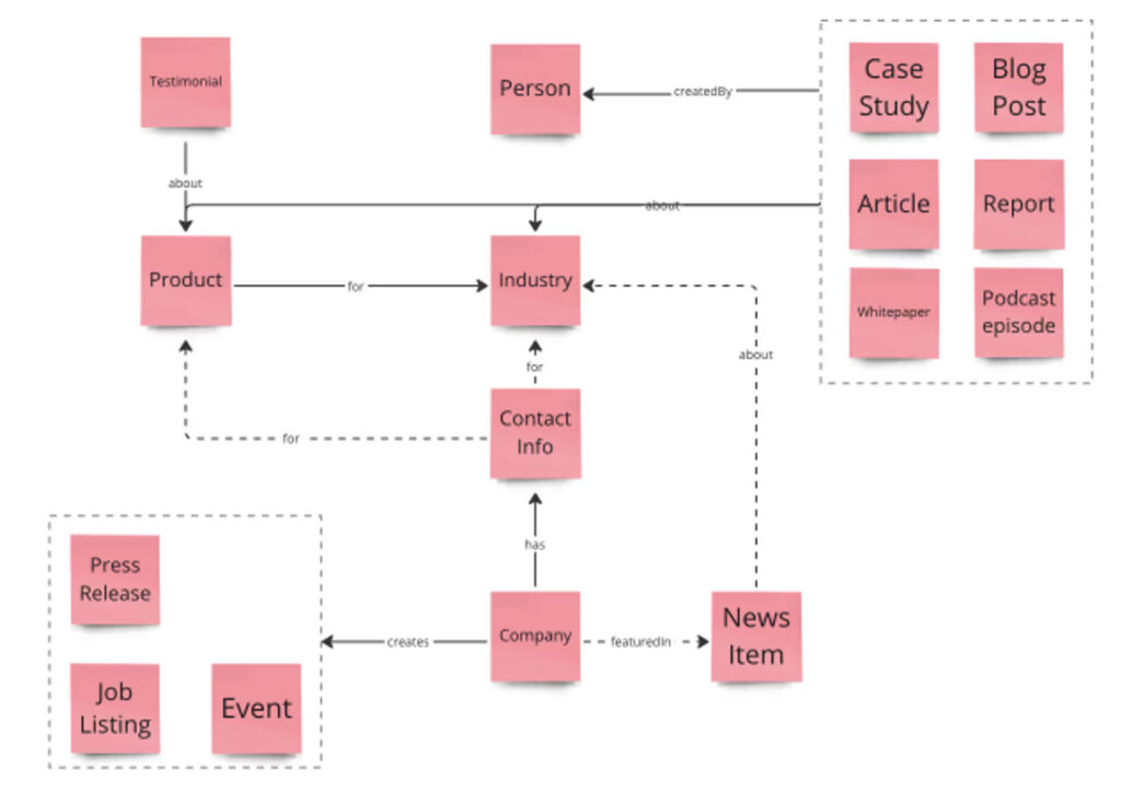
A content model is a visual diagram that maps various content types and their interrelationships within the site.

When you open the Spotify app, you don’t see all 1383 music genres(!). Not all book subgenres are displayed on the library’s homepage, either. Rather, users would only see the most popular genres or a personalized list that’s populated dynamically based on their reading preferences.
How does that happen? Through content modeling! Book is a key content type for the library, and Genre is one of its attributes. For fiction books, librarians can tag the book to the following genres:
- Fantasy
- Horror
- Mystery
- Romance
- Science Fiction
- Thriller
- Western
They’ll want to tag it to subgenres too. One of my favorite books, One Hundred Years of Solitude, would be tagged to Magical Realism, a Fantasy subgenre.
Other book attributes would include author, description, language, publication year, publisher, number of pages, availability, locations that carry the book, and systematics (how to physically locate the book in the library).
Common content modeling mistakes: what to watch out for
1 – Lack of clarity on dependencies or future project phases affected by content modeling
A content model facilitates a common understanding among various disciplines and stakeholders regarding the relationships between different content types.
Going back to our conversation, dear imaginary library employee, you may have heard from colleagues at the web agency contracted by your employer that they are developing a content model. However, you may be unclear about how this aligns with your current responsibilities and overall project success.
Dependencies and future project phases related to content modeling are often unclear, and responsible UX team members may overlook this. I’m guilty of it too. Each team operates differently, so it’s important to seek clarification in case one of us forgets.
Content modeling generally informs web design stages like UX wireframes, visual design, technical scoping, and copywriting.
- Content model outcomes may include UX and visual designers knowing the templates and pages they need to design: the locations landing page, location page template, genre landing page, and book page template.
- Technical scoping typically involves regular discussions with engineers on the project to review progress, identify any concerns from a budget or timeline perspective, and provide recommendations. At this point, engineers also get a better understanding of technical requirements for building the platform.
- For copywriters, the content model provides a robust framework that facilitates effective planning, enabling them to efficiently allocate time and identify the subject matter experts (SMEs) required for key pages.
2 – Failing to determine information needs
Content modeling experts risk giving too much or too little information. Who needs to know what and why? This is the question to keep in mind.
I’ve worked on some projects that didn’t require presenting the content model to client stakeholders. Some projects don’t even need a content model. Consider a self-published author’s website, designed to give readers a way to purchase the newest book. There’s no need to show the author how the back-end will function or make it complicated.
Certain clients have a particular interest in content modeling. Establishing modular content models covering different content and user types can increase content scalability, reduce human error, enhance content visibility, and get more bang for the buck overall.
I find content modeling fascinating; however, not all clients are prepared for or interested in this level of scalability, especially if their emphasis on high-touch engagement is what sets them apart.
3 – No legend
What’s a post type, what’s a category, what’s a template? How do content types relate to one another? How are they constructed? Does content type mean one thing in a content management system (CMS) and another in a different CMS? The answer to the last question is always yes.
A legend is a visual key that explains symbols used in a specific diagram, associated colors, and line types depicting entity relationships like one to many, many to many, etc.
I’m guilty of building “self-explanatory” content models that 1. needed explaining for others and, 2. needed explaining for my own damn self a year later. Legends really help.
4 – Not differentiating between automated and manual content
Considering all the different post types, categories, and templates, it’s important to highlight which sections of these pages are populated automatically and which need manual curation. There’s a big difference between:
- automatically displaying the latest online events in key pages
- having website managers manually add event links to the homepage and, in Vienna’s case, 37 location pages.
The larger and more complex the site, the higher the likelihood of someone misinterpreting their required involvement in content management.
Surprisingly, this happens the other way around too, with people looking visibly relieved upon learning that they will be able to edit elements they believed were fixed and unchangeable. For example, a location-specific Staff picks website component would allow employees from each location to highlight their favorites for the community.
5 – Failing to acknowledge integrations
Many companies display data visualizations on their websites. These data vis are often embedded and managed in third-party tools like Tableau. There are Salesforce form submissions. Crosswords. Quizzes. Booking software. Payments. Chat. Newsletters. Maps.
Excluding integrations in a content model can result in mismatched expectations between execs, staff, and vendors.
Executives may anticipate that the new system will eliminate the need for a particularly costly software.
Vendors may not fully understand the significance of certain integrations for library staff members, which could lead to these integrations being overlooked or not considered at all in engineering estimates. This may lead to potential delays, budget constraints, scheduling challenges, and quality compromises (usually UX shortcuts unfortunately).
As Lisa Maria Martin said in the introduction of one of my favorite IA books:
“Whatever our role, we are designers of information. Our choices alter the presentation and flow of human knowledge. We control how people find, understand, and use information in every facet of their lives. We must be very, very careful.”
Lisa Maria Martin. Everyday Information Architecture. A Book Apart, 2019.
Building and launching websites seems straightforward, but rarely is (outside of startup environments). It usually involves a stirring process that requires buy-in, collaboration, and risking social capital from various departments and stakeholders—some of which leave mid-project together with their critical project knowledge—over months or years, and hopefully, but not always, results in a shipped product.
Whether you’re redesigning the information architecture of a website or a mobile app, this article will hopefully help you identify potential disruptions early on and address them—and yourself and your team—with grace and care.

Leave a Reply